Nodle visual identity
Role: Lead designer, illustrator
Design ask: Maintain distinctive and cohesive brand visuals that align with current and changing marketing messages and product needs as the company and product features grow
Design ask: Maintain distinctive and cohesive brand visuals that align with current and changing marketing messages and product needs as the company and product features grow

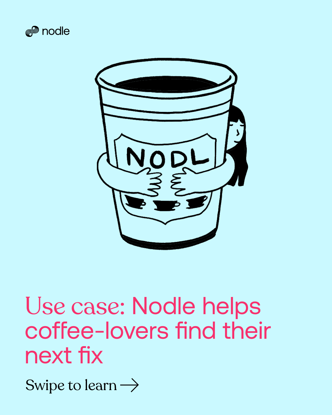
After Nodle's complete visual rebrand, I joined the team as a brand designer to maintain and further develop the guidelines. We focused on deeply exploring how, why, and where each design element should look, move, and interact as we applied them to new projects and partnerships while the company continued to grow and evolve. One major challenge was connecting our audiences with Nodle’s content, use cases, and technology explanations. To address this, we aimed to incorporate illustration as a friendly and human touch within our highly technical Web3 world. This led us to explore and define the right illustration style for a wide range of assets—both those we currently need and those we will create in the future for various audiences.
*I will mainly highlight illustrations and flat graphics in this case study.
However, the scope of work spans from out-of-home assets to technical papers and presentations to advertisements and long-form animations.
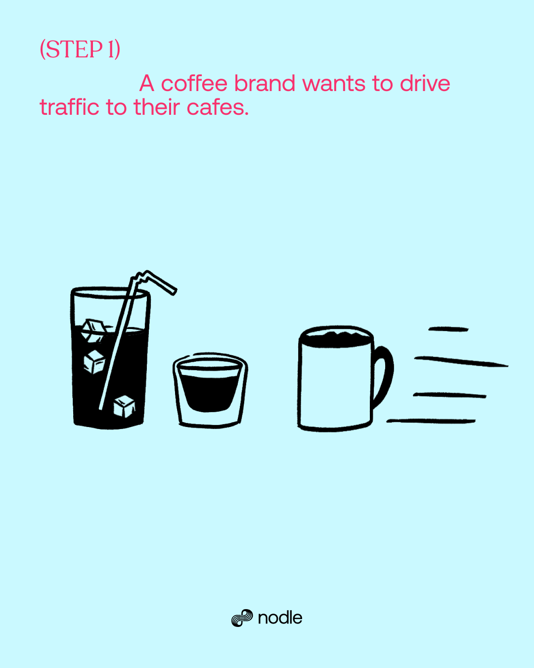
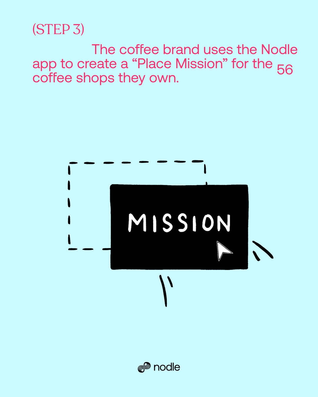
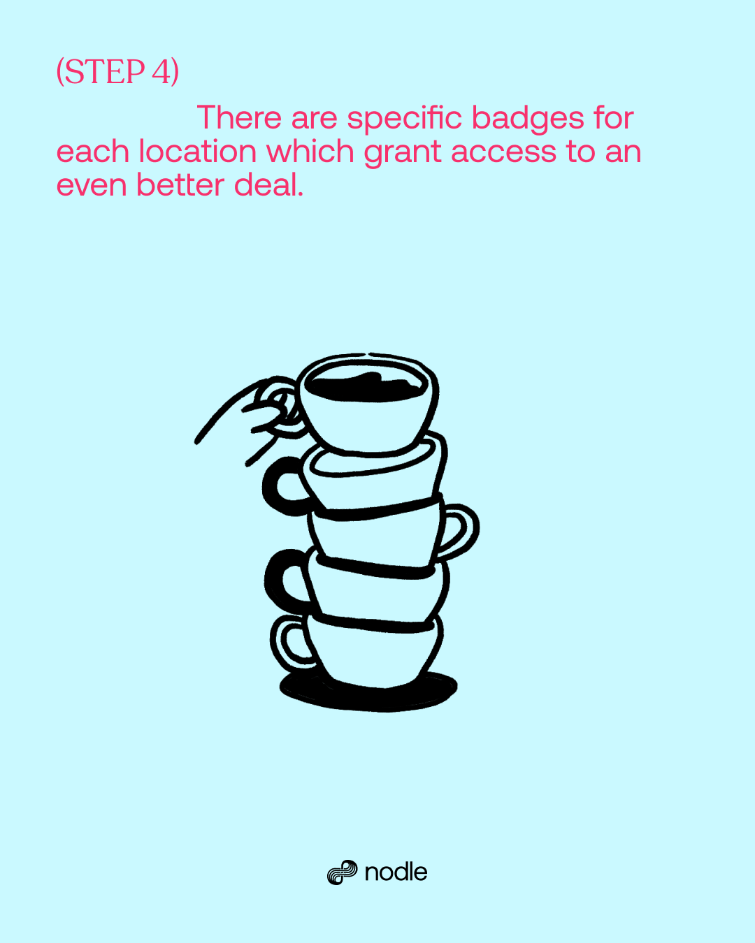
Because our products and overall Web3 terminologies are still very new and often complicated to casual and crypto-curious audiences, we chose to be visually smart and relate heavy information with things we can easily comprehend from our daily knowledge.
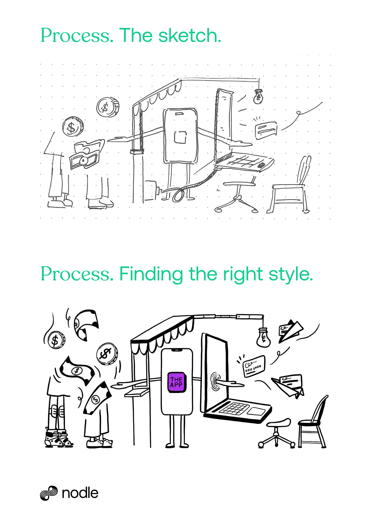
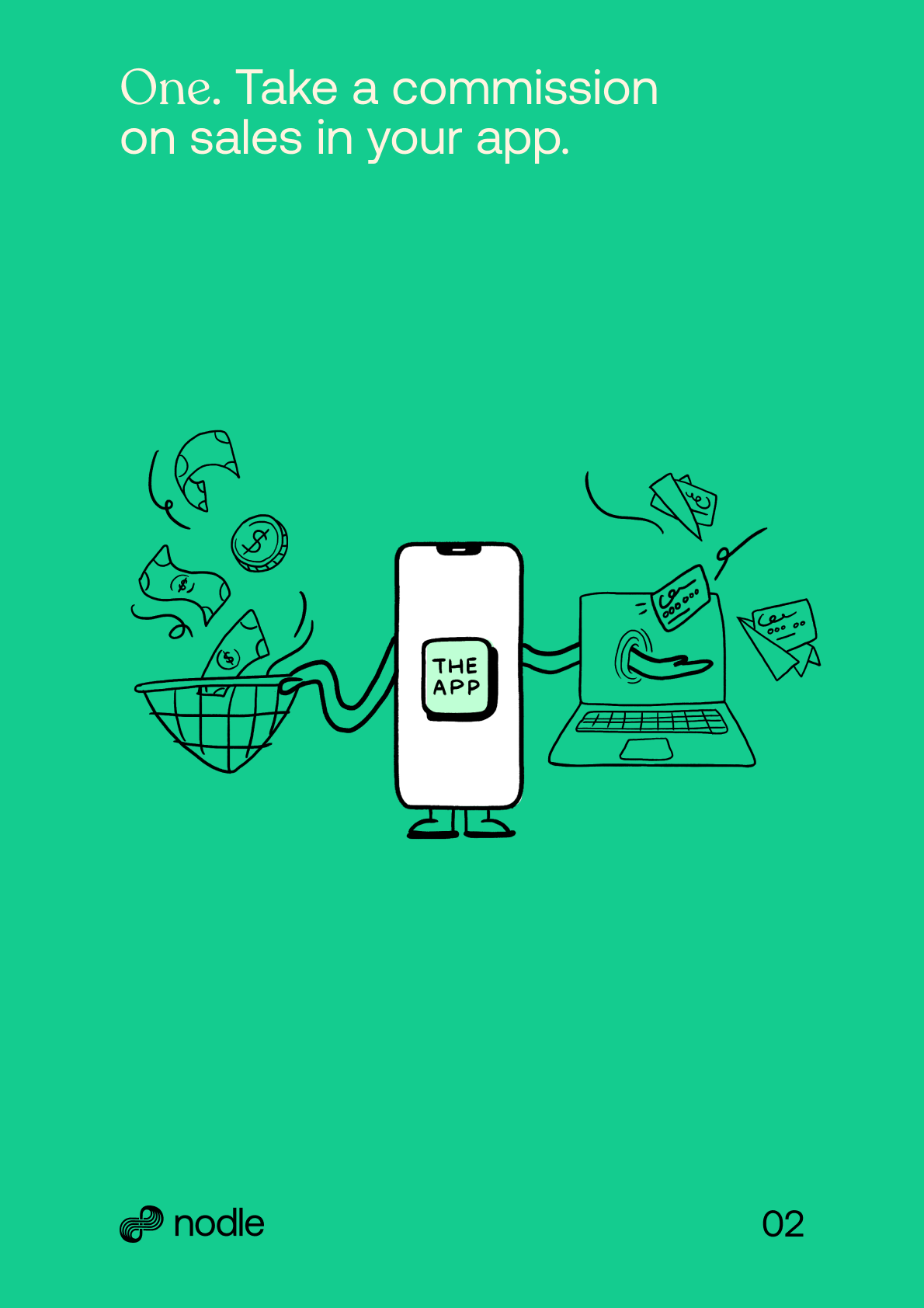
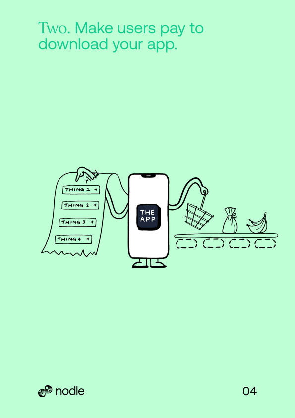
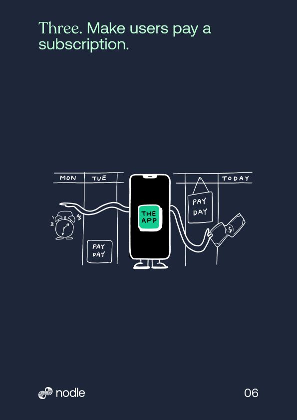
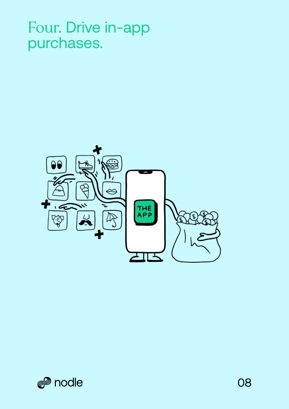
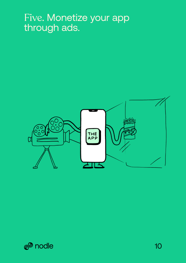
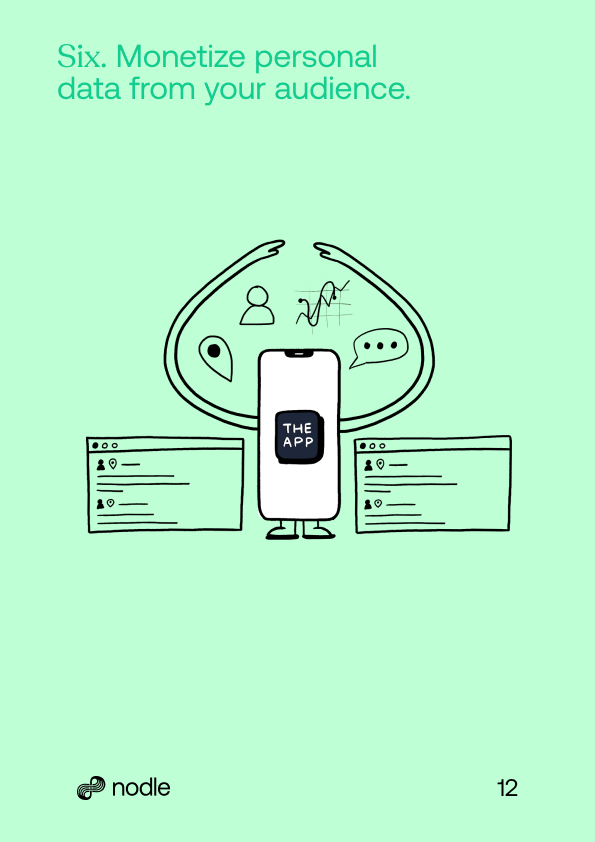
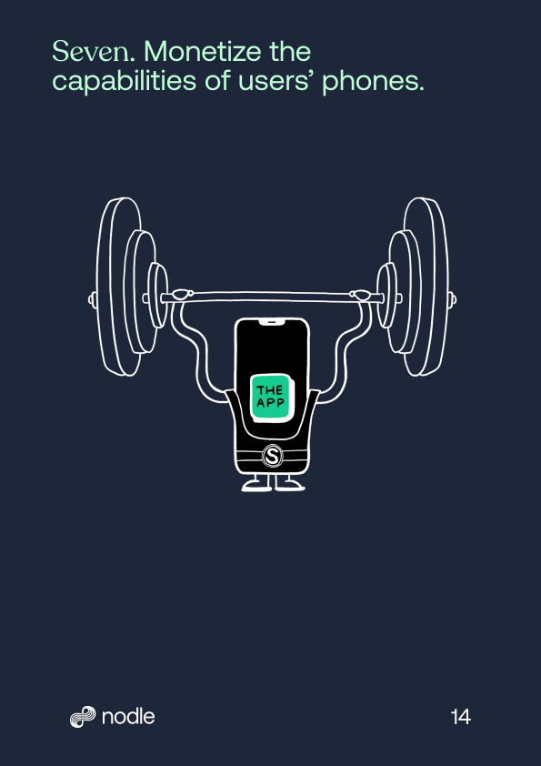
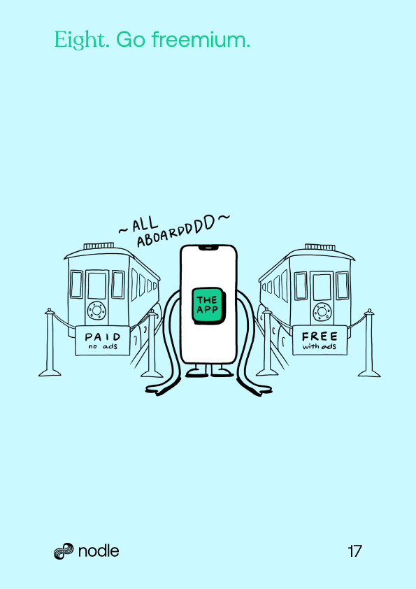
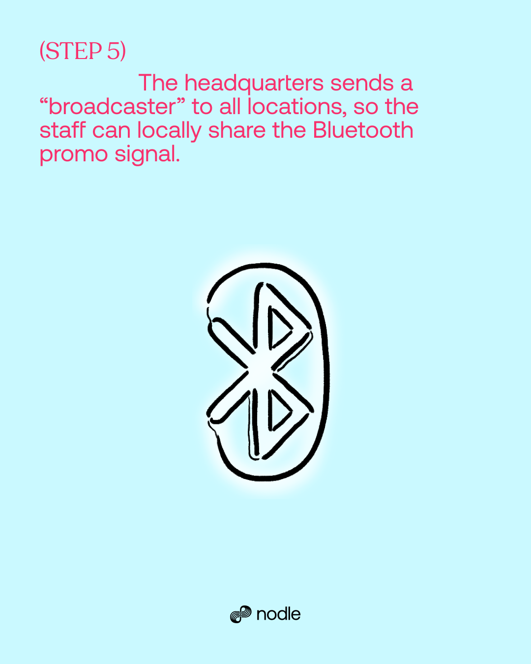
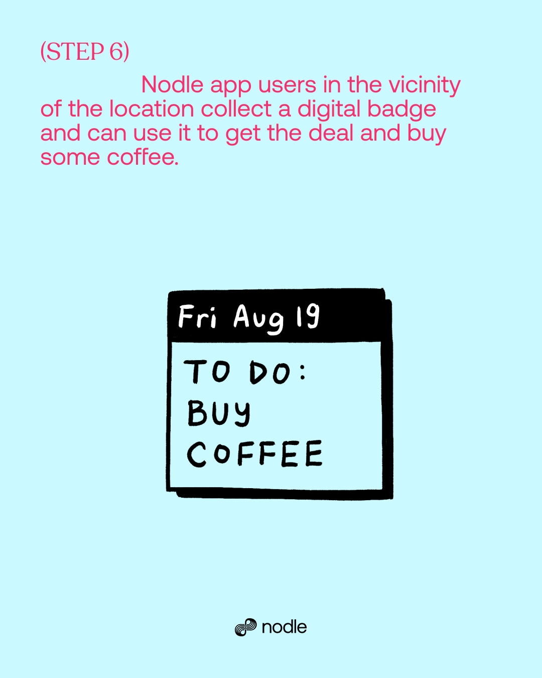
Our illustrations are drawn with freehand and loose lines that aren’t exactly straight or proportionally accurate. This helps to make it feel playful and relaxed against our minimal typeface, and geometric elements.
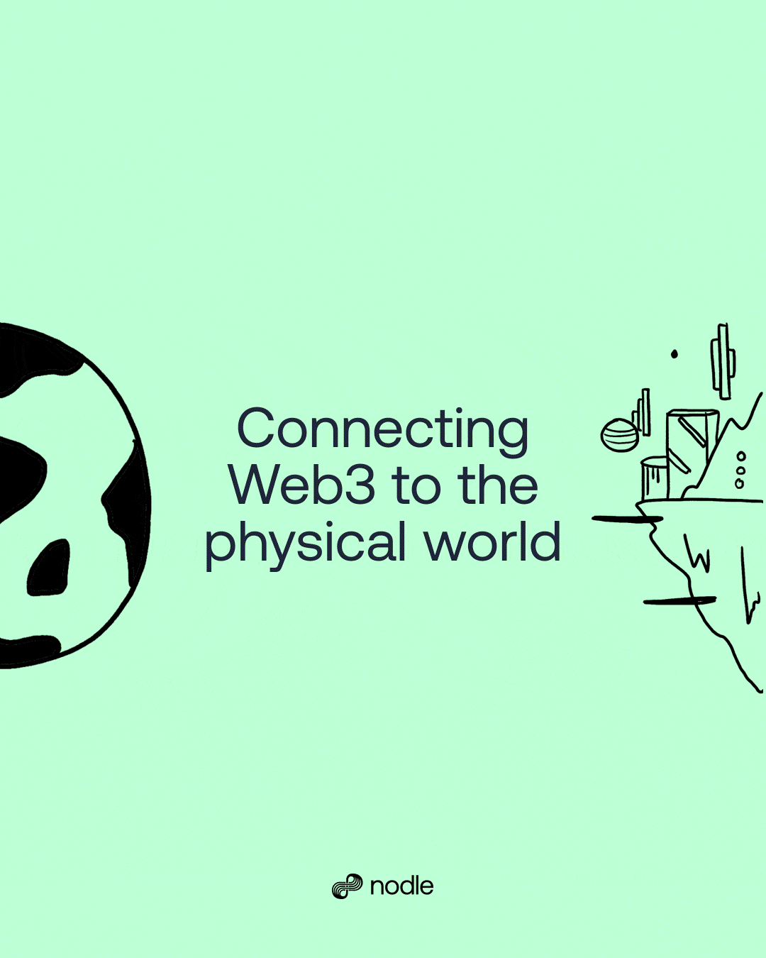
The visual language blended well together through different use cases and projects to communicate different messages from educating to advertising.
As an example, we created a partnership video to launch the integration of Nodle with the Ledger wallet, combining 3D animation with the simplicity of our colors and typography to craft a striking visual language.
As an example, we created a partnership video to launch the integration of Nodle with the Ledger wallet, combining 3D animation with the simplicity of our colors and typography to craft a striking visual language.

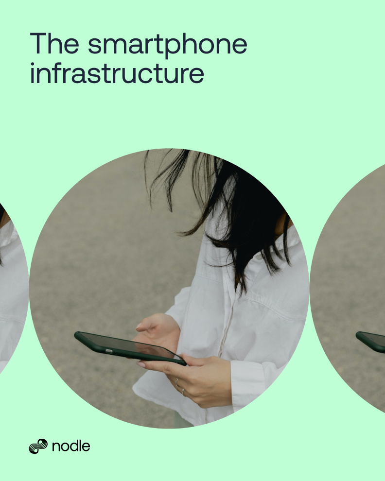
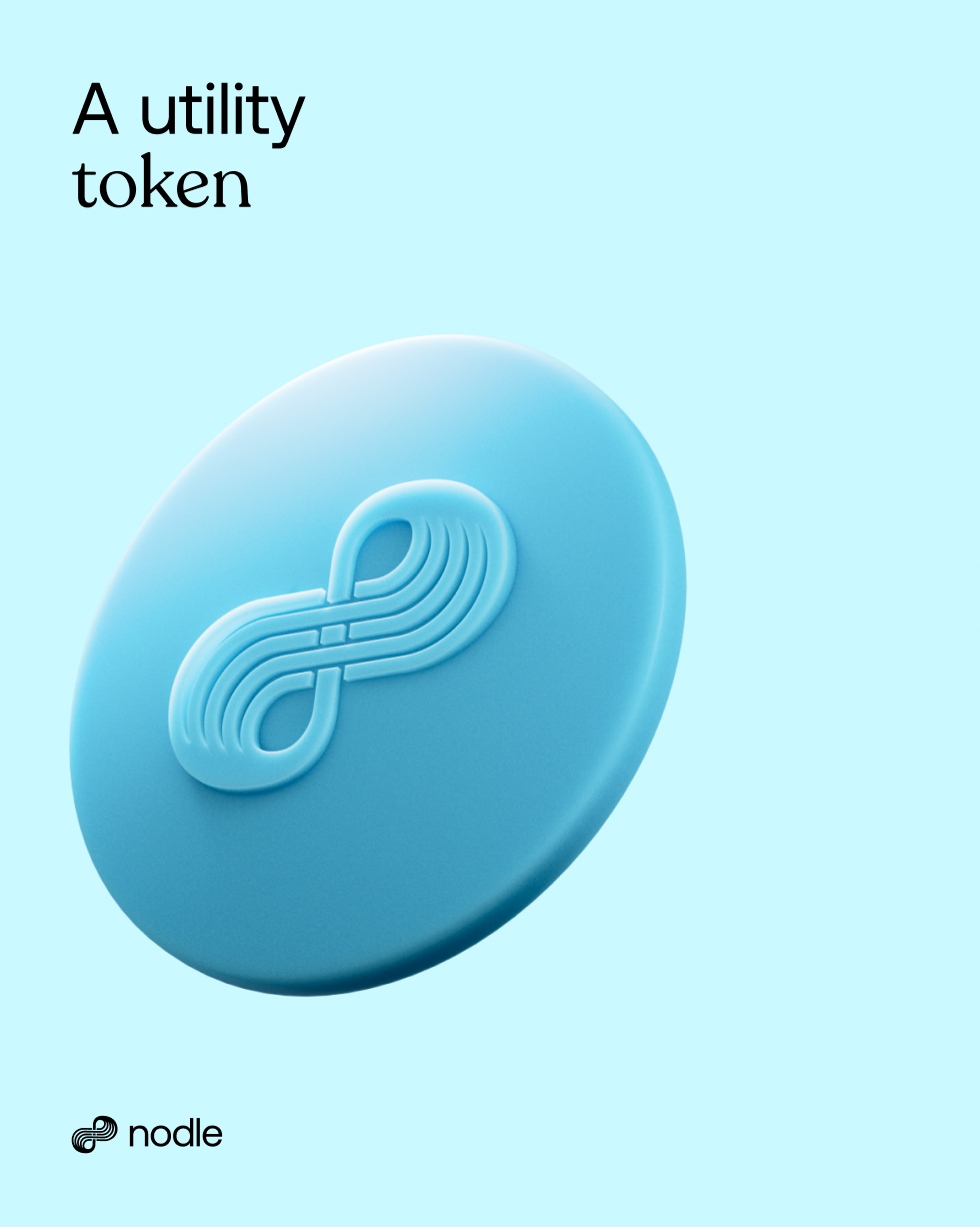
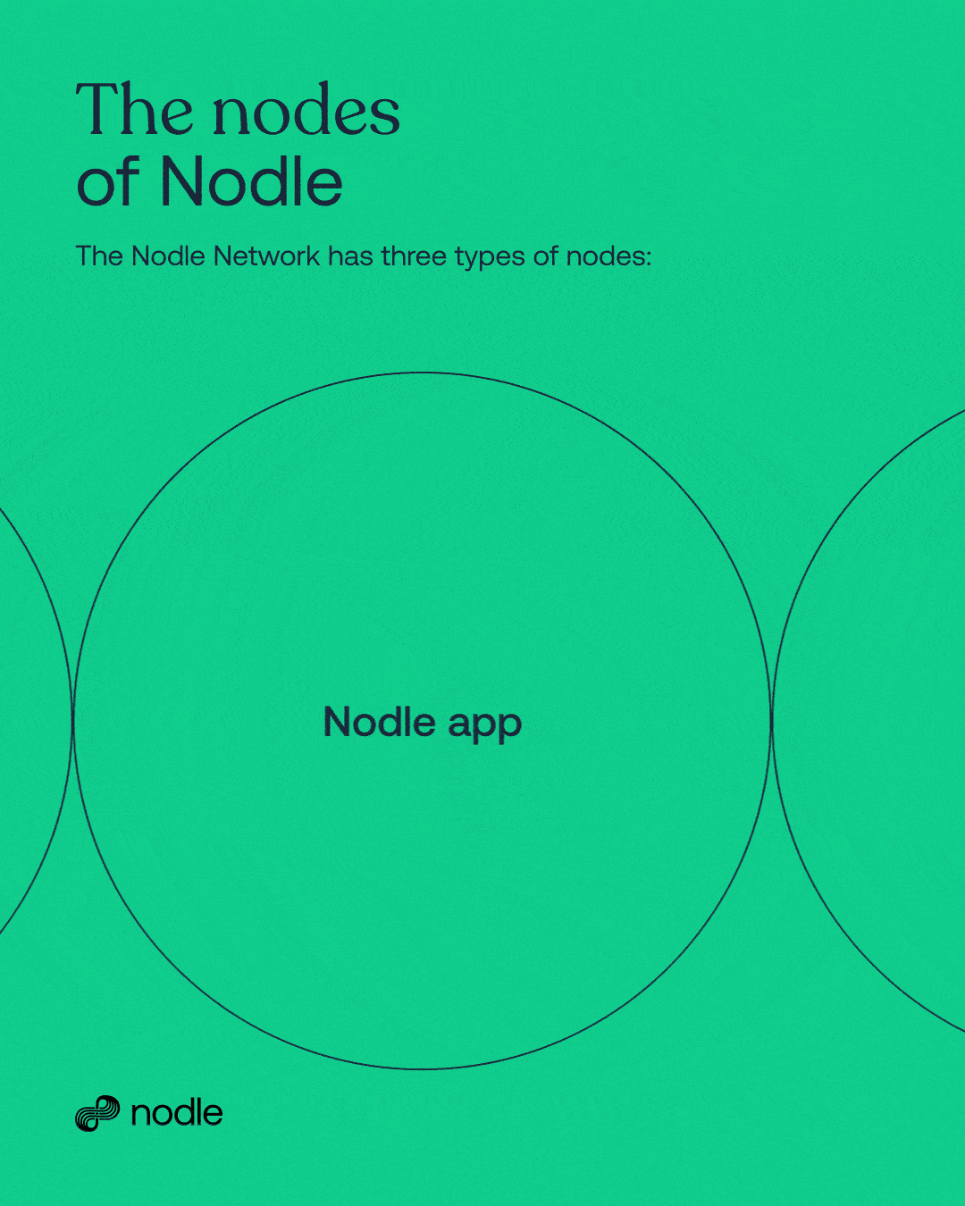
With this, we implemented consistency in our other graphic elements such as the circle, use of images, and 3D, following a very simplified approach where we limited the options of type size, size of graphical elements, and the use of grids— a small menu of options allowed us to stay very focused on our visual language while forcing us to be creative in other ways within the set rules.